About CSS Grid
Why devote a site to layout with CSS Grid? If you've been building websites over the past 25 years or so (as I have), you've been on a quest for a powerful, yet intuitive layout tool to turn your design ideas into reality. None of the tools that came before were up to the job. So, when CSS Grid came out and all of the major browsers supported the spec in 2017, it was cause for celebration.
Well known writer, speaker, and designer, Andy Clarke, says
"Alright, I’m going to get straight to the point. CSS Grid is important, really important, too important to be one of those 'I’ll use it when all browsers support it' properties. That’s because, with CSS Grid, we can now be as creative with layout on the web as we can in print, without compromising accessibility, responsiveness, or usability. If you’re at all serious about web design or development, you need to be serious about learning and using CSS Grid too." (source)Grid proponent Rachel Andrew made the case for using CSS Grid in her article Is it really safe to start using CSS Grid Layout?
CSS Grid is a two dimensional layout system, meaning it can work with rows and columns at the same time. The grid structure is defined in CSS, as opposed to HTML (as was the case with table-based layouts), and the layouts can be redefined with media queries to adapt to different screen sizes. It also allows us to change the location of page elements based on media queries, even if that means displaying elements differently from their source order in the HTML. Furthermore, CSS Grid solves the problems associated with "Holy Grail" layout in that achieving equal height columns on a row is a breeze. Page elements can also be layered completely or partially. The code is intuitive (especially the grid-areas property) and fewer lines of code are usually needed than with previous layout techniques.
About This Site
This site is about CSS Grid – made with CSS Grid. The HTML and CSS were completely hand-coded, using no frameworks and no content management systems.
The site is made with a mobile-first responsive approach using min-width media queries to adapt to various screen sizes. For the most part, breakpoints are based on the needs of content as opposed to display sizes.
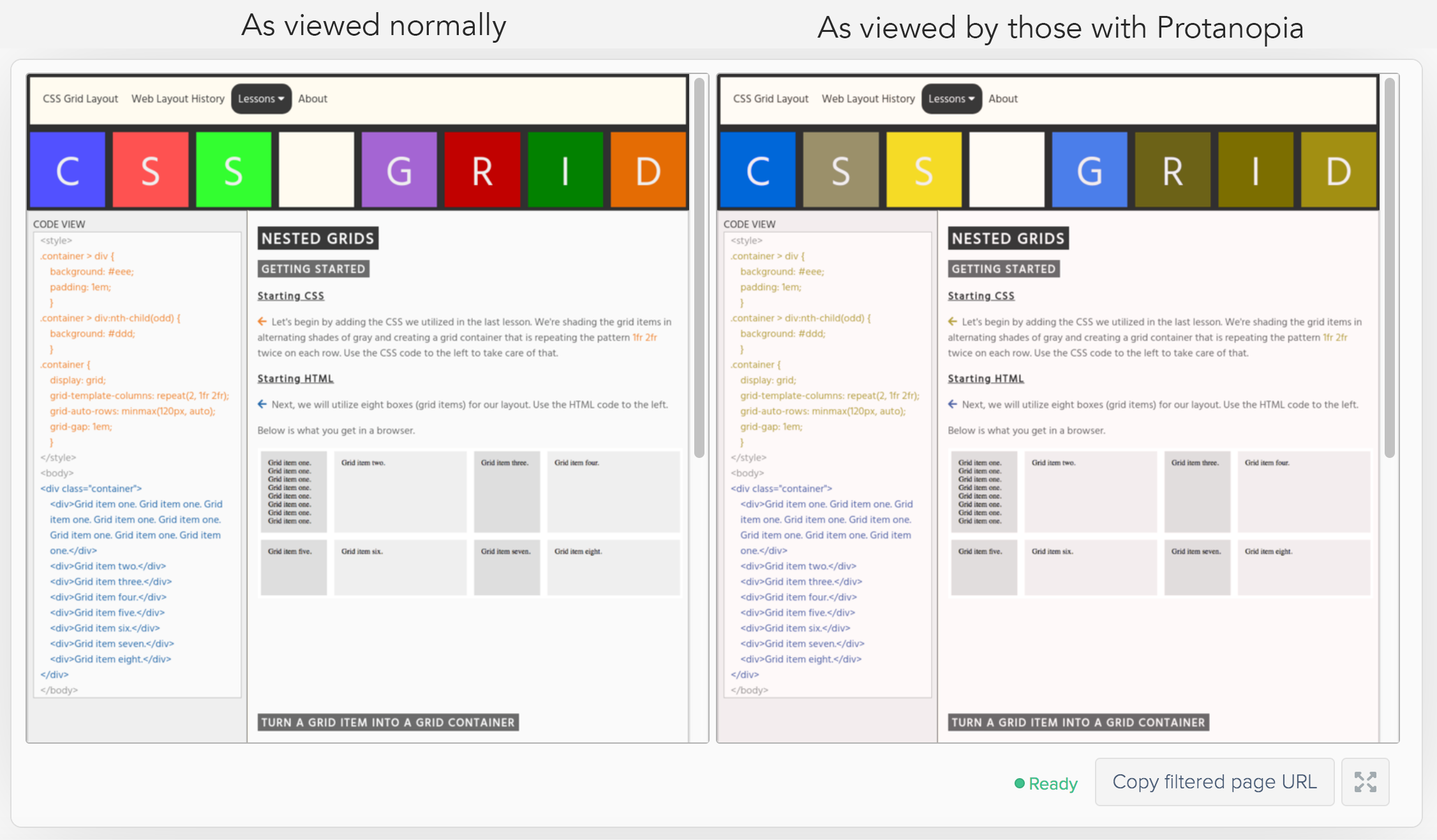
The use of colors to make distinctions between the CSS and HTML code could be problematic for those with color vision deficiency (CVD). For example, red and green used together can be problematic. People with CVD may see both red and green as brown. Common colorblind-friendly colors used together include orange and blue. While orange may appear more brown to those with CVD, it tends to work well with blue since blue would usually look blue to those with CVD. As much as possible, a colorblind-friendly palette has been used. The code used to indicate the CSS is orange (#ef8636) while the HTML code is indicated with blue (#2a6aaa).
In the image on the right below, you can see how a person with Protanopia (red/green color blindness) would see the contrasting orange and blue text colors. You'll notice that although the orange looks more brown (or almost green), it still maintains good contrast with the blue.
More Information: https://www.tableau.com/about/blog/2016/4/examining-data-viz-rules-dont-use-red-green-together-53463
All images and photos were created/shot by the site's author, unless otherwise noted.
Contact Information
Dr. Steven D. Anderson
James Madison University
School of Media Arts & Design
Harrisonburg, VA 22801