C
S
S
G
R
I
D

Layout with Grid Areas

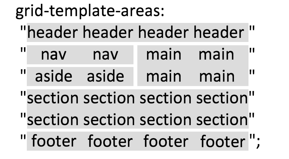
Perhaps the most intuitive way to handle layout with CSS Grid is to use grid areas. Grid areas allows you to give layout names to HTML elements and then visually represent the layout within the code itself. Some have likened it to ASCII art, a situation where type itself forms an image, such as seen here. We'll see how that works with CSS Grid's areas later in this lesson.

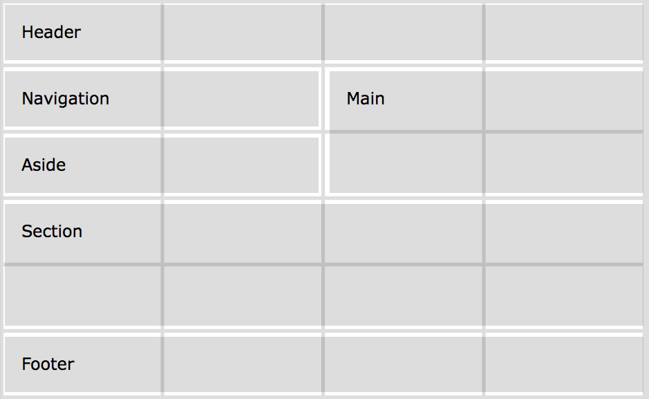
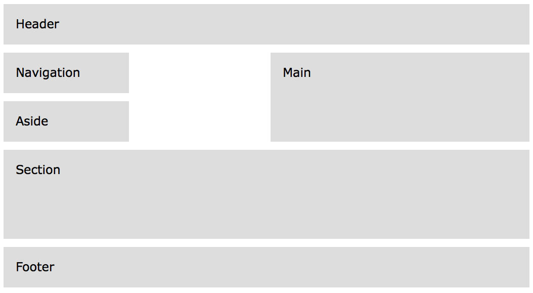
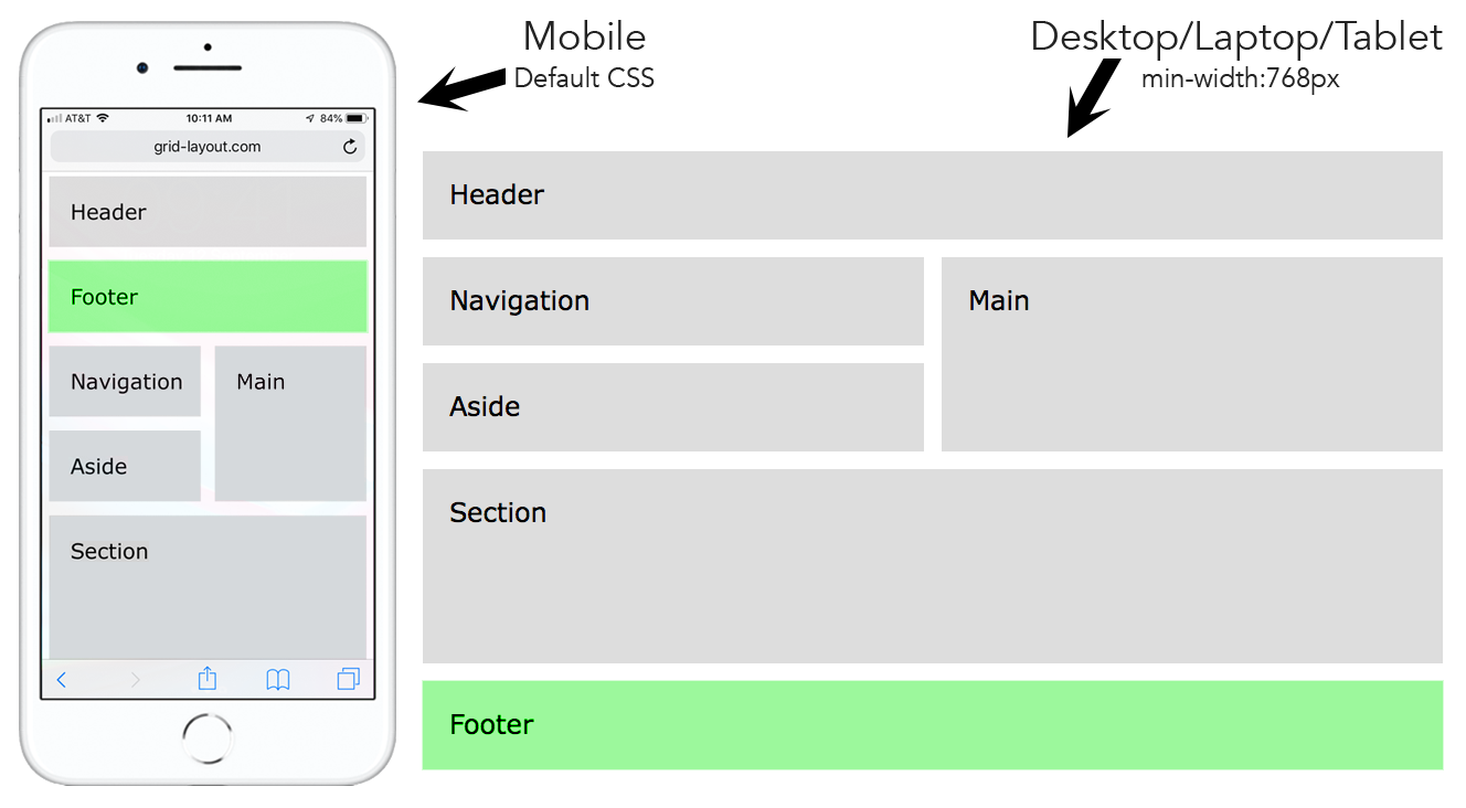
We will create the layout below using grid areas. We've taken the liberty of drawing gray lines over the layout to show the number of columns and rows and their locations. Notice that this layout is using four columns and six rows.

<style>
.container {
display: grid;
grid-template-columns: repeat(4, 1fr);
grid-auto-rows: minmax(80px, auto);
grid-gap: 1em;
max-width: 1200px;
}
</style>
<body>
<div class="container">
<header>Header</header>
<nav>Navigation</nav>
<aside>Aside</aside>
<main>Main</main>
<section>Section</section>
<footer>Footer</footer>
</div>
</body>

Starting CSS

This is a four column grid container using grid-template-columns: repeat(4, 1fr). We have set the minimum height of each row to 80 pixels with grid-auto-rows: minmax(80px, auto). Notice we have used a max-width of 1200 pixels for the container with max-width: 1200px. This will keep it from going extremely wide on large screens.

Starting HTML

There are six grid items, but notice that we are using HTML 5 semantic elements such as header, nav, aside, main, section, and footer instead of generic elements (DIV)s. We could have used DIVs, but it's better to use semantic elements wherever possible.

The result is what is shown below, an implicitly created grid with the six elements in a four column layout.

Now, we'll use grid areas to place the grid items onto the grid as we want them.

<style>
.container {
display: grid;
grid-template-columns: repeat(4, 1fr);
grid-auto-rows: minmax(80px, auto);
grid-gap: 1em;
max-width: 1200px;
}
header {
grid-area: header;
}
nav {
grid-area: nav;
}
aside {
grid-area: aside;
}
main {
grid-area: main;
}
section {
grid-area: section;
}
footer {
grid-area: footer;
}
</style>
<body>
<div class="container">
<header>Header</header>
<nav>Navigation</nav>
<aside>Aside</aside>
<main>Main</main>
<section>Section</section>
<footer>Footer</footer>
</div>
</body>

Naming the Grid Areas

First, add the grid-area property to name each element. You can name the grid areas anything you want, but it makes sense to give them the same names as the elements. For example, the header element will be given the following name: grid-area: header. Do this for each element on the page that you want to place on the grid.

<style>
.container {
display: grid;
grid-template-columns: repeat(4, 1fr);
grid-auto-rows: minmax(80px, auto);
grid-gap: 1em;
max-width: 1200px;
grid-template-areas:
"header header header header"
"nav nav main main"
"aside aside main main"
"section section section section"
"footer footer footer footer";
}
header {
grid-area: header;
}
nav {
grid-area: nav;
}
aside {
grid-area: aside;
}
main {
grid-area: main;
}
section {
grid-area: section;
}
footer {
grid-area: footer;
}
</style>
<body>
<div class="container">
<header>Header</header>
<nav>Navigation</nav>
<aside>Aside</aside>
<main>Main</main>
<section>Section</section>
<footer>Footer</footer>
</div>
</body>

Using grid-template-areas

Finally, add the grid-template-areas property to the container. The values for that property will be typed out on rows surrounded by quotes. Essentially, each cell of the grid will contain a grid-area name. Since we want the header to take up all four columns of the first row, we type out "header header header header". Use the same process on the other rows.

The result below is much like how ASCII art works. The code itself is a visual representation of the layout.


<style>
.container {
display: grid;
grid-template-columns: repeat(4, 1fr);
grid-auto-rows: minmax(80px, auto);
grid-gap: 1em;
max-width: 1200px;
grid-template-areas:
"header header header header"
"nav . main main"
"aside . main main"
"section section section section"
"footer footer footer footer";
}
</style>
<body>
<div class="container">
<header>Header</header>
<nav>Navigation</nav>
<aside>Aside</aside>
<main>Main</main>
<section>Section</section>
<footer>Footer</footer>
</div>
</body>

Adding White Space

Adding white space to the layout is easy with grid-template-areas. Simply replace an element name with a period, as shown to the left. Notice the period in the second column of row two and the second column of row three.

Below is how it looks in a browser.

<style>
.container {
display: grid;
grid-template-columns: repeat(4, 1fr);
grid-auto-rows: minmax(80px, auto);
grid-gap: 1em;
max-width: 1200px;
grid-template-areas:
"header header header header"
"footer footer footer footer"
"nav nav main main"
"aside aside main main"
"section section section section"
"section section section section";
}
@media only screen and (min-width:768px) {
.container {
grid-template-areas:
"header header header header"
"nav nav main main"
"aside aside main main"
"section section section section"
"footer footer footer footer";
}
}
</style>
<body>
<div class="container">
<header>Header</header>
<nav>Navigation</nav>
<aside>Aside</aside>
<main>Main</main>
<section>Section</section>
<footer>Footer</footer>
</div>
</body>

Moving Element Locations

Before CSS Grid, moving the element locations on a page was extremely difficult. Ordinarily, elements are placed on the page in their HTML source order. However, suppose you want the footer in its current location (at bottom of the layout) for desktops/laptops and tablets, but you want the footer to be directly below the header on mobile devices. This is what is called changing the DOM order or the HTML source order. Before CSS grid, it would have required a JavaScript hack.

We've added a media query (@media) so that the footer moves from being directly below the header for mobile to the bottom of the layout for screens 768 pixels and higher. By first listing the CSS for mobile and then using a min-width media query, we are using a mobile first approach.