Web Layout History
Tim Berners-Lee

Enrique Dans from Madrid, Spain [CC BY 2.0 (https://creativecommons.org/licenses/by/2.0)], via Wikimedia Commons12 November 2024; Sir Tim Berners-Lee, Founder of World Wide Web/CTO, Inrupt, on Centre Stage during day one of Web Summit 2024 at the MEO Arena in Lisbon, Portugal. Photo by Lukas Schulze/Web Summit via Sportsfile
Credit for inventing the World Wide Web (HTML and HTTP) belongs to Tim Berners-Lee. Berners-Lee wasn't a designer - he was an engineer and computer scientist working at CERN (The European Organization for Nuclear Research) in Geneva, Switzerland. He was interested in developing a new system to share research among his colleagues. Much of that research contained text, figures, graphs, and images and there was no easy way to share these things. The Internet at that time was mainly for text.
In 1989, Berners-Lee proposed an Internet-based hypertext/hypermedia system and by 1990 he came up with the first specification for HTML. He also wrote the first web server specification (HTTP) and web browser.
Berners-Lee was less interested in pretty formatting. For that reason, the original specification for HTML didn't contain any real ability to accurately control layout on the page.
An early website (from 1992) can be seen below and at: http://info.cern.ch/hypertext/WWW/TheProject.html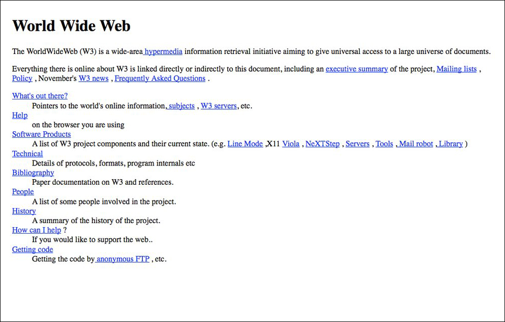
Presentational HTML Tags
The mid-1990s was an era when the major browser manufacturers (Netscape and Microsoft) added tags to allow designers to control the look of their pages with "presentational" tags such as <b> for bold and <i> for italic. A range of tags also allowed changes to font size <font size="+2">, font face <font face="verdana">, and the color of page elements with tags such as <font color="blue"> and <body bgcolor="#e6e6fa">. Even some degree of image alignment could be accomplished with an attribute to the <img> tag such as <img src="smiley.gif" align="left">.Using HTML to control layout soon became a huge problem for web developers to maintain pages. Changes would have to be made in multiple instances on multiple pages of a site. Plus, founders of the web, such as Tim Berners-Lee, had envisioned HTML to be used only to define the structure of a document, not to control presentation.
The Single Pixel GIF Trick
A favorite hack of the time was the use of single pixel transparent images (GIFs) to add spacing between elements on a page. As a transparent image, anything behind this pixel, like a background image or color, would show through.
A single pixel image downloaded quickly and since it was unseen (transparent), a designer could simply alter horizontal and/or vertical spacing by adding spacing attributes such as <img src="smiley.gif" hspace="75"> or the width and/or height attributes such as <img src="single.gif" width="150"> to create any amount of blank space desired. It was a common hack for opening up limited amounts of white space or to create indention at the beginning of paragraphs.
Example: The space here... ...is created by a one pixel image set to a width of 150 pixels.
Table Layout
The use of presentational tags and single pixel transparent images provided limited tools to control page layout. It was soon discovered that using data tables could be a powerful tool for handling layout. By 1996, the use of tables for layout took off. Tables were designed in the early specs for HTML to hold tabular data in rows and columns, but it soon became apparent that the individual cells of a table could be used to hold page elements together in a multi-dimensional layout.
The code on the left below resulted in a basic layout where one could envision the top row containing a header, the left column would contain navigation, and the main page content would go to the right.
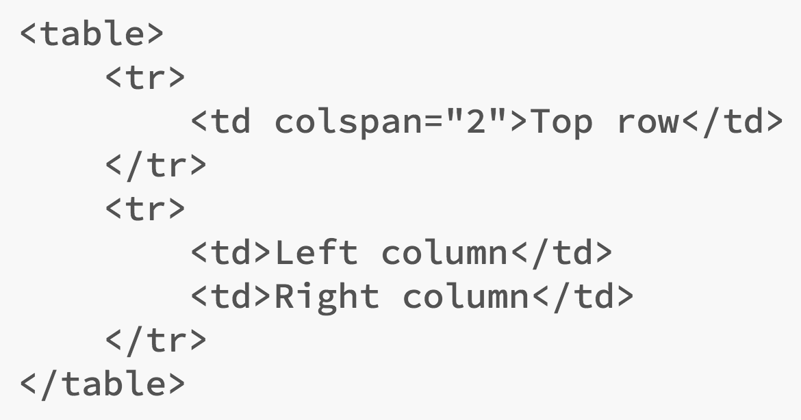
| Top row | |
| Left column | Right column |
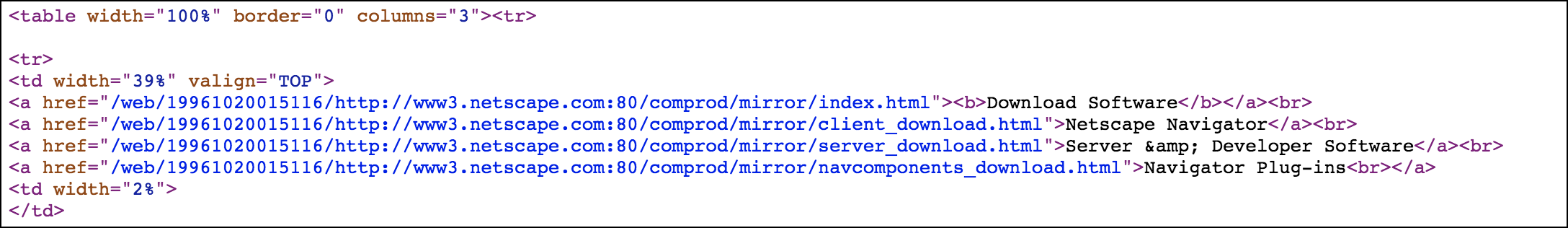
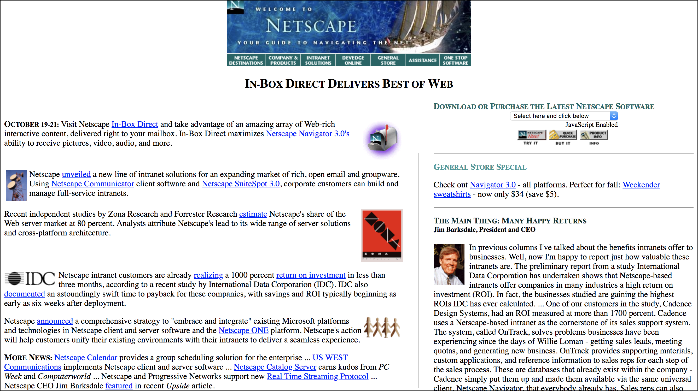
An early Netscape site shows the use of a table for layout.
Although not designed for layout, tables became the "go to" method for laying out page content well into the 2000s. Like the use of presentational tags outlined above, the use of HTML tables to control presentation broke with the rationale of HTML to be used only to describe a page's structure. Editing pages was cumbersome and difficult.
Frames
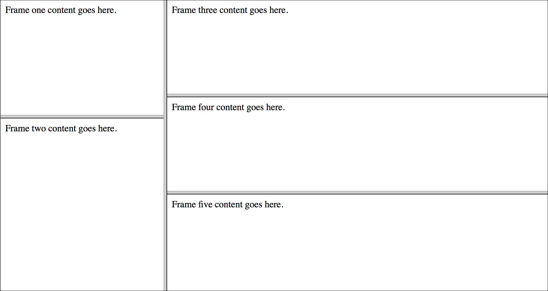
Around the same time that tables were being used for layout, the use of HTML frames was popular. Using the <frameset> tag, an HTML document could specify areas of the page where other HTML files could be included using <frame src> tags. Framesets could even be nested for greater control. The example below shows how five separate pages are included within a master <frameset> tag.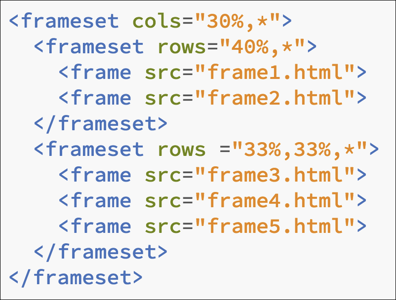
Of course, this system meant that developers had to manage multiple files for just one layout. Frames were problematic for other reasons as well. Bookmarking framed pages didn't work well, there was often confusion about sending people links to framed pages, and they weren't search engine friendly. Like tables, using frames for layout broke the intention of the web to keep structure and presentation separate.
Client-Side Imagemaps
Client-side imagemaps are large images with clickable areas (hotspots) that link to other pages. Graphic designers loved image maps because they could create sophisticated images in Photoshop and know that the design would look exactly the same once viewed in a browser. Image map hot spots were created with some simple HTML code that specified coordinates for rectangles, circles or polygons.
The image below has mapped out coordinates for a rectangle (the flag), a circle (the beach ball), and a polygon (the beach hut). These hotspots could then be linked to other pages such as shown with the code below.
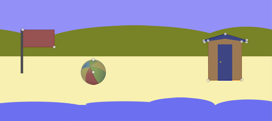
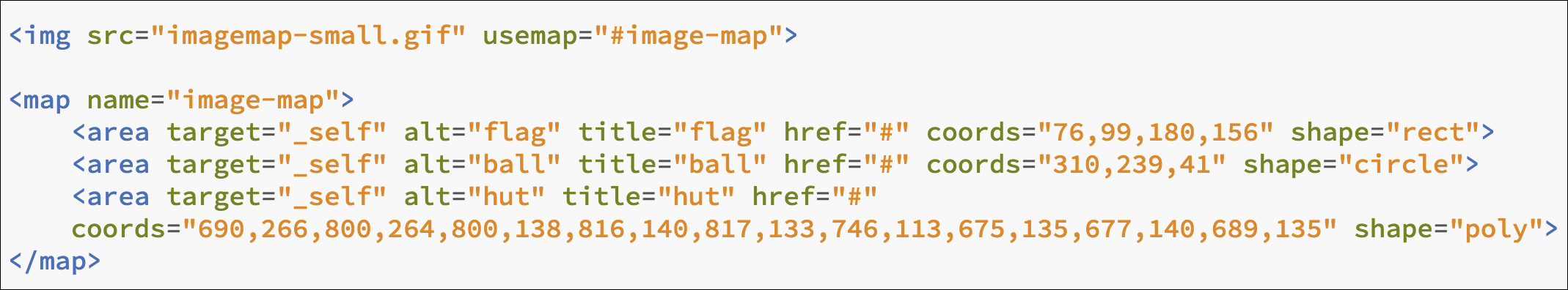
Coordinates were based on pixel locations from the left side of the image and from the top of the image. So, a rectangle with the first two numbers 76 and 99 means the upper left corner of the rectangle is 76 pixels from the left and 99 pixels from the top. The second set of numbers (180 and 156) means the lower right corner of the rectangle is at 180 pixels from the left and 156 pixels from the top. Circle coordinates identify the center first (310, 239) and then state the radius in pixels (41). Polygons show number pairs for each point in the shape.
With imagemaps there was no concern about how to control page layout. The entire layout of a page could be done with one large image. Of course, that meant long download times and headaches for anyone wanting to make changes. As with tables and frames, it again violated the goal of the web to separate content from presentation.
Cascading Style Sheets
In the late 1990s, a major movement got underway to bring some order to HTML. The big players in the browser wars (Netscape and Microsoft) actually got together and agreed to phase out (deprecate) presentational tags. At the same time, the goal of separating structure from presentation got a major boost with the adoption of Cascading Style Sheets or CSS.
CSS allowed style information to be kept separate from the structural representation of a page (HTML). Style rules could be kept in a separate document (external style sheet) and changes to the style sheet could affect the look of all, or multiple, pages on a site. Those styles could be overridden within individual pages by using either internal styles (rules in the <head> of the document) or inline styles (rules applied within html tags themselves) where exceptions were needed.
The World Wide Web Consortium released the first recommendation for CSS (CSS1) in 1996. (It can be seen at https://www.w3.org/TR/REC-CSS1/). An update, CSS Level 2, was published in 1998 and it provided new layout capabilities like fixed (position: fixed), absolute (position: absolute), and relative position: relative) positioning and z-index. Adoption was slow because it wasn't until around the turn of the century before any browsers had full support for CSS.
CSS 3 drafts were first published in 1999. Unlike CSS 1 and CSS 2 which were large single specifications, CSS 3 was divided into separate modules. Each module defined new features which could be rolled out and updated separately. CSS 3 is the current spec for CSS and we continue to see new modules, many of which have given us powerful new tools for layout such as Flexbox and CSS Grid.
DIVS and the "Box Model"
The <div> element was created as part of CSS to divide a page into logical sections. It was really intended to be a replacement for tables, the most common method used for layout up to that point. The <div> tag can be used to hold text and images in a layout. These "boxes" can also be given a width and/or height. They can have a border and can even allow for padding (space around content in a box) and margins (space around the outside of the box).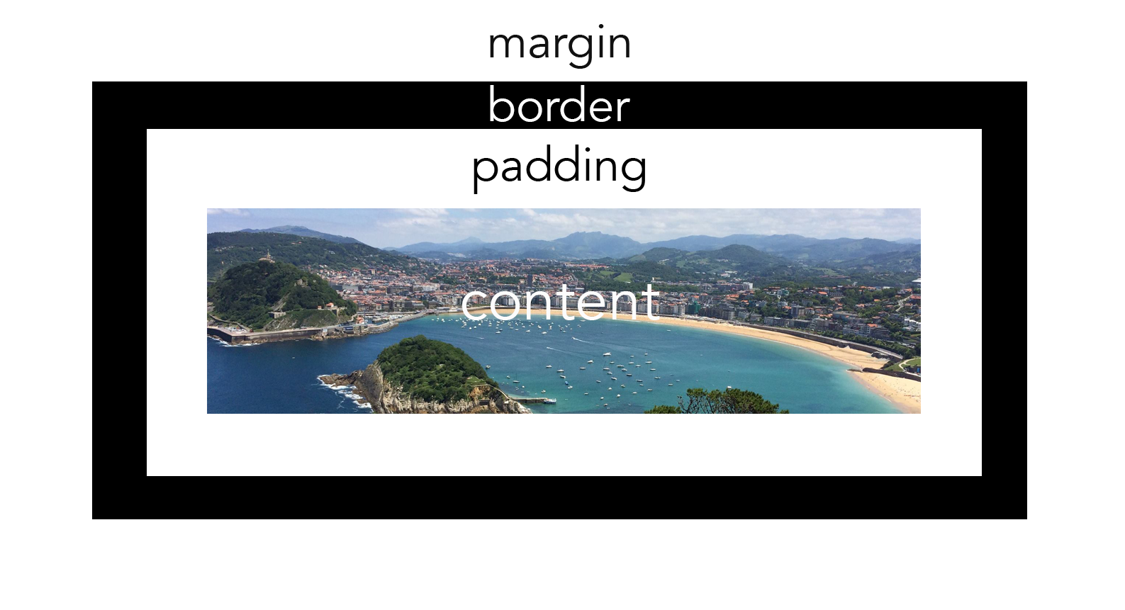
CSS Position Property
By default, <div>s are block-level elements and they stack one above the other vertically on the page unless positioned in some way. The first CSS tool for handling alignment of these elements was the position property (i.e. position:fixed). The position property is still part of the spec and is still very useful today. There are five different position values:
- static
- relative
- fixed
- absolute
- sticky
position: static is the default way elements are positioned. position: relative positions elements relative to their normal position. position: fixed is positioned relative to the viewport (browser window), meaning it stays in place on the screen even when the page is scrolled. position: absolute positions elements relative to the nearest positioned ancestor. position: sticky positions elements based on the user's scroll position.
Sometimes elements need to overlap other elements. To determine the Z-axis (depth dimension) stacking order, z-index was created. For example, an element with a z-index: 2 will show up on top of an element with a z-index: 1.
Absolute and relative positioning are useful for aligning some elements, but are limited in their ability to effectively control layout for an entire page.Floated Layouts
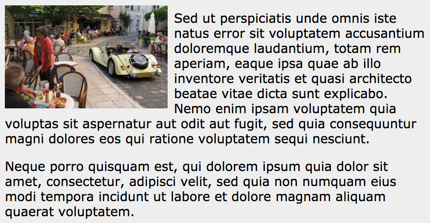
The float property was initially intended to allow text to align to the side of an image and to wrap underneath when the text block is taller than the image. Values include left, right, none, or inherit, though the most common are left and right. The image below shows how floats were intended to be used. In this case, the image is floated to the left with float: left being applied to the image.
It was discovered that floating <div> elements could also be an effective and natural way to position elements on a page. Applying floats to <div> tags allows you to size boxes to fit inside a container and then float them one next to the other. When the width of adjoining boxes together exceeds the width of the container, the next <div> simply shifts down to the next row.
Since the early days of CSS, floats have been the most common method used for positioning. Floats allow elements to float into open spaces right next to other elements and can be controlled based on the size of their container.
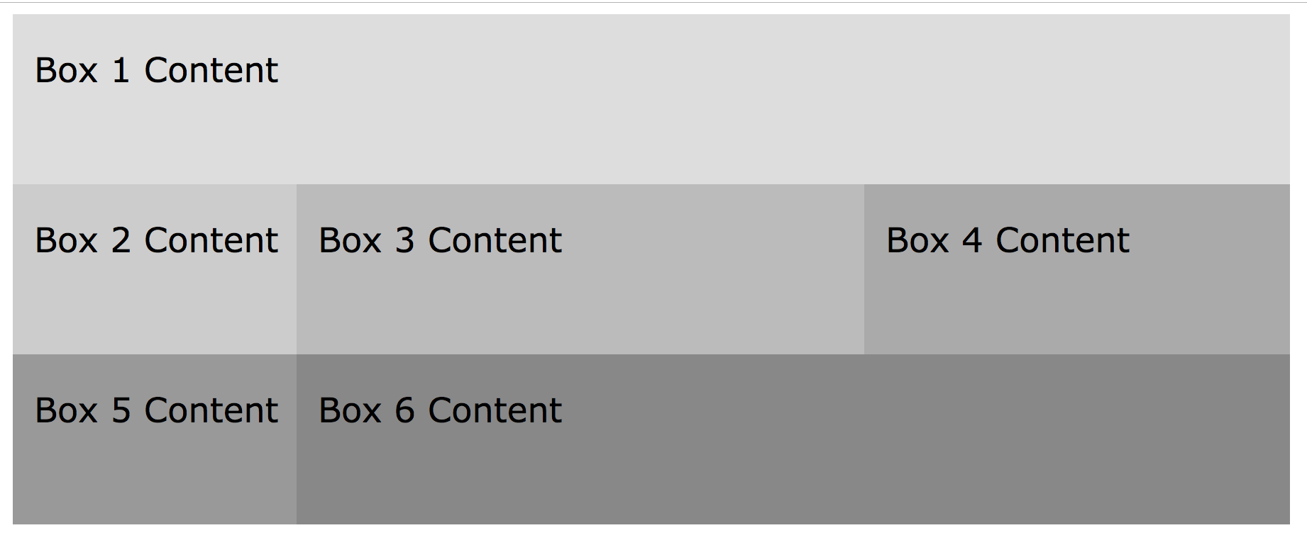
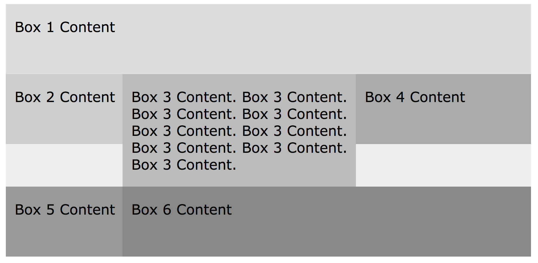
Floats in Action
In this example, the container is set to a width of 900 pixels. The nested boxes are all set to float: left. Box 1 is 900 pixels wide, so it exactly fits on the first row and box 2 has to shift down to the next row. Box 2 is 200 pixels wide. Box 3 is 400 pixels wide, and Box 4 is 300 pixels wide. Together, boxes 2, 3, and 4 are 900 pixels wide, so they all fit together on the second row. Box 5 doesn't fit, so it moves down to the bottom row. It is 200 pixels wide. Finally, box 6 is 700 pixels, so it takes up the remaining space on the bottom row.
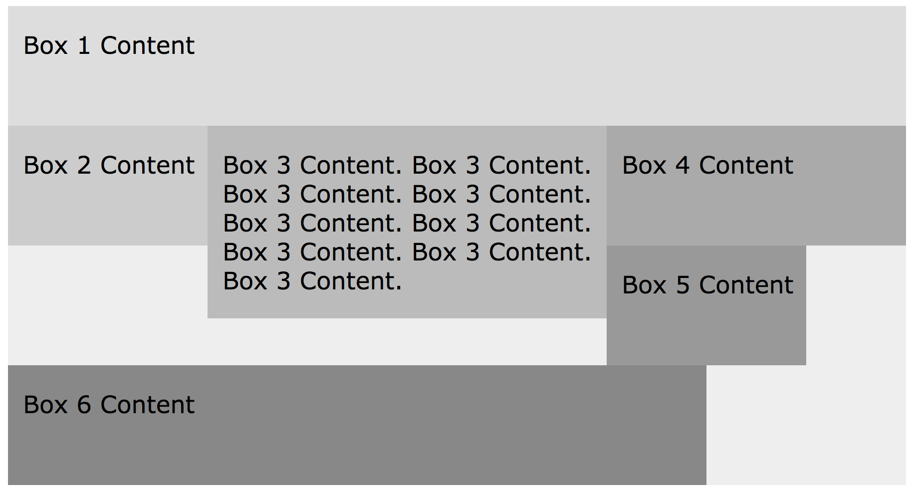
The Hanging Float
A common problem with floated layouts is what might be called a hanging float. If floating elements to the left, a hanging float is created when an element on the same row is taller than the content of a box to the right of it. In this example, box 5 should clear all the way to the next row, but instead gets caught up on the box with greater height. In this case, box 5 is getting hung up on box 3.
Clearing Floats
Fixing the hanging floats requires that you clear the float on the element that is getting hung up. So, we have to add clear: left or clear: both to the <div> for box 5. Now, it goes all the way down to the next row and starts on the left side of the layout.
Constantly clearing floats has been standard procedure for web developers for many years, but it's been a pain. Web developers have been looking for something better than using floats for layout.
Mobile and Responsive Sites
The iPhone was introduced in 2007. By 2010, smartphone penetration in the U.S. had reached about 27 percent and by 2016 it had grown to more than 80 percent (source). Smartphone ownership is even higher among those who are younger or more affluent. Among 18 - 29 year-olds, 92 percent say they own a smartphone (source). Today, more people browse websites on mobile devices than on computers (source).
Before smartphones became ubiquitous we made pages to fit the display resolution of computers, but small mobile devices soon changed all that. At first, web developers made separate mobile and desktop versions of their sites. Maintaining two separates sites was tedious and challenging.
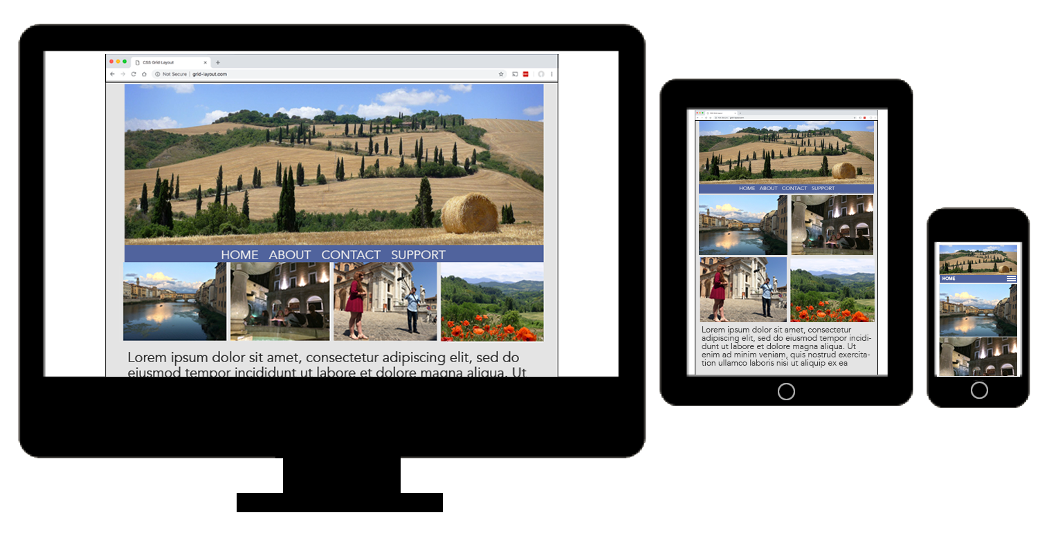
Today, the trend is to make one site that adapts to the display size of the device. Responsive web design (RWD) attempts to make web pages render well on a variety of devices and screen sizes. The goal is to make pages that are both easy and satisfying to use.
The illustration below shows how a web page needs to change its layout to adapt to different screen sizes.
Responsive web design relies on media queries to know when to change layout. A media query is a piece of CSS code that determines the resolution of the device showing the page. It then serves up different CSS or layouts based on what it determines. In the example below, text inside the header will render at 1.2em if the display resolution is 768 pixels or wider.
@media only screen and (min-width: 768px) {
header {
font-size: 1.2em;
}
}
CSS Grid is especially well suited for making responsive web pages.
CSS Frameworks
As the need for responsive sites has grown, so has the complexity of layout. This complexity led to the development of a number of frameworks to make responsive site creation easier.
Frameworks are nothing more than some pre-written CSS that web designers can use to more easily construct a grid for layout. The two most widely used are Foundation and Bootstrap, but there are many others.
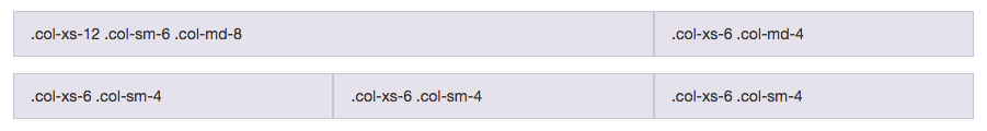
Most frameworks utilize a built-in 12 column grid system for creating responsive layouts. With 12 columns, one can get the greatest number of equal width columns on a row. The grid below shows that it's possible to have 1, 2, 3, 4, 6 and 12 equal width columns with a 12 column grid.
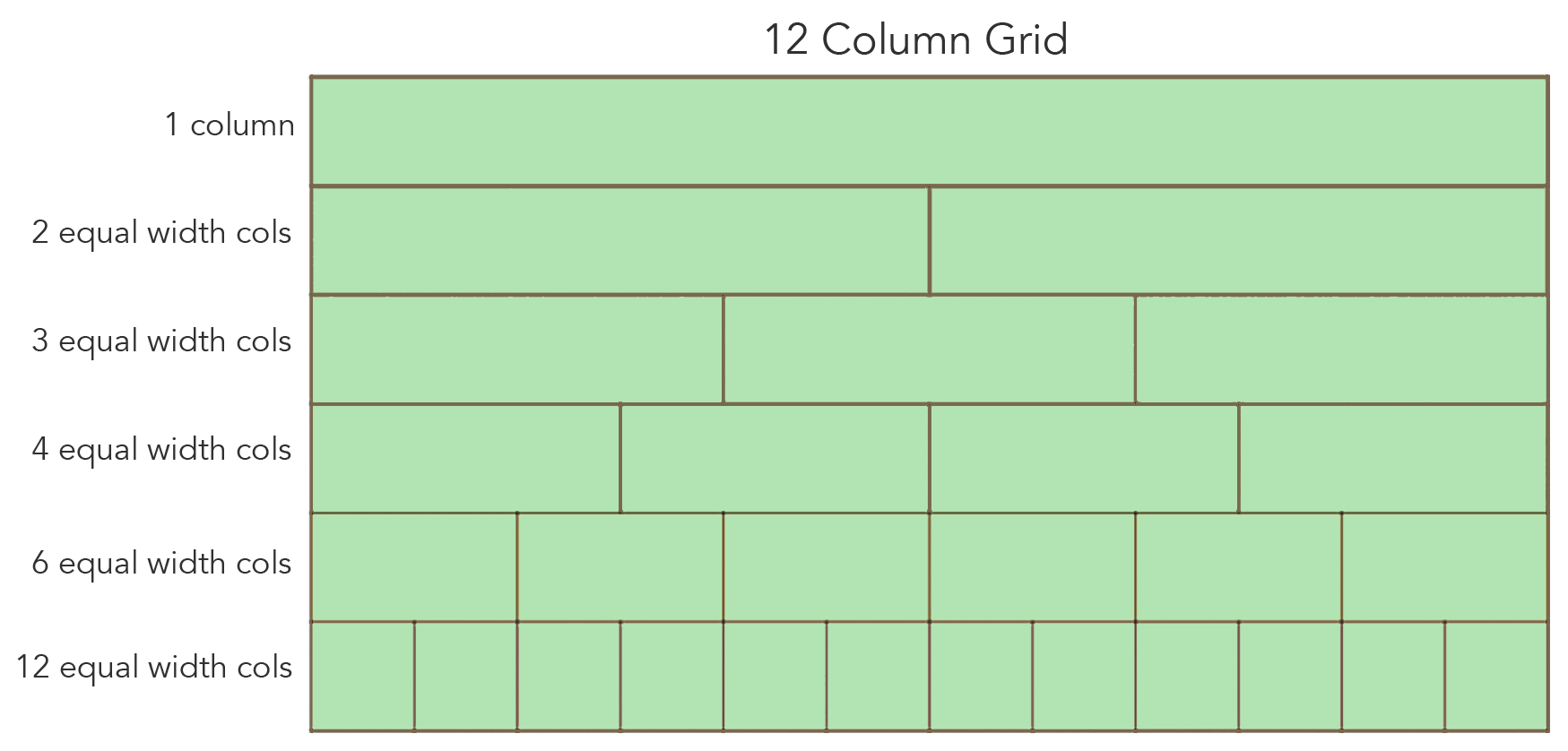
No other number below 12 gives as many options. Of course, if equal width columns on a row are not a concern, a 12 column grid is still useful because it gives numerous options for layout.
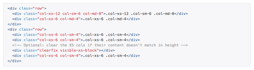
Bootstrap also has a range of interface components to help make forms, buttons, and navigation, along with JavaScript extensions. Bootstrap 3 was written using floats for layout. Bootstrap 4 was written using Flexbox. It comes with pre-written CSS that allows web developers to utilize Bootstrap class names to more easily create layouts.
There are four different classes (lg, md, sm, xs) that correspond to the size of the column for different screen sizes. The "lg" class is for a screen size of 1170 pixels, "md" is for 970 pixels, "sm" is for 750 pixels, and "xs" is for screens smaller than 750 pixels.
For example, an element that is supposed to take up 8 columns on laptops/desktops (1170 pixels or more) and 12 columns on small mobile devices would be written as such.
<div class="col-lg-8 col-xs-12">That's it. Bootstrap's classes have the CSS already in place to make that layout happen. You simply apply the class to your HTML and Bootstrap takes care of the rest.
A more real-world example of the coding is shown below.
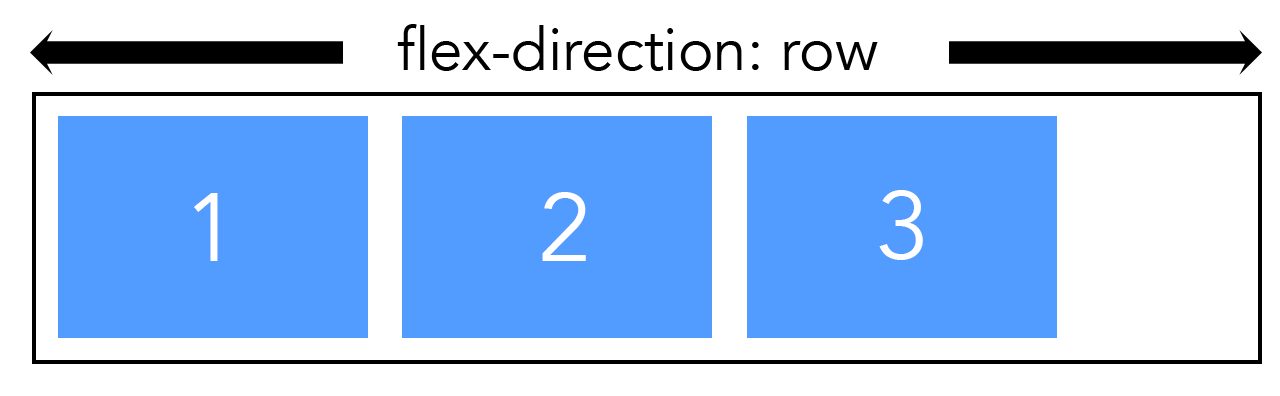
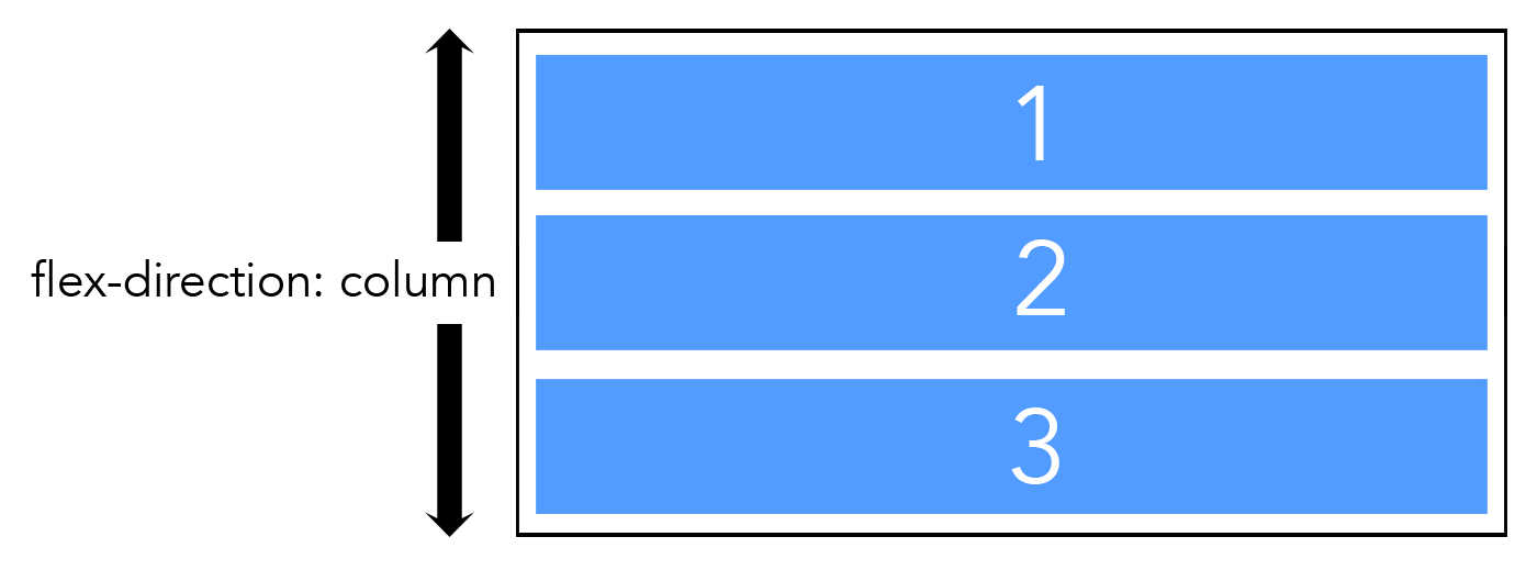
Flexbox
Flexbox is a one-dimensional layout tool for laying out elements in rows or columns. It was designed to solve many of the problems with positioning and floats. The first working draft for Flexbox was published in 2009, but it underwent a number of changes and the working draft wasn't published until 2013.
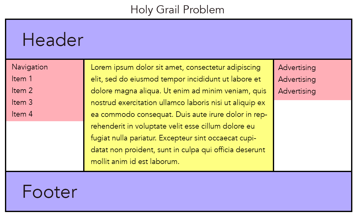
Finding the Holy Grail
One of the problems Flexbox (and CSS Grid) solved was something known as Holy Grail Layout (The problem was so great, it became like trying to find the Holy Grail). Creating equal height columns on the same row with different amounts of content had challenged web designers for years. It was easy to do in the days of table-based layout, but tables were difficult to maintain and were not semantic. Before Flexbox, all known solutions had drawbacks. Solutions included divs with table-property displays, absolutely positioned divs, and JavaScript hacks.
In the illustration below, you can see that the second row has three columns. The middle column is the highest, therefore it fills up all the available space. However, the first and third elements have less content. Getting each element to take up the entire height without needing to add more content was the challenge.
The example below shows the elusive Holy Grail - making all three columns equal in height.
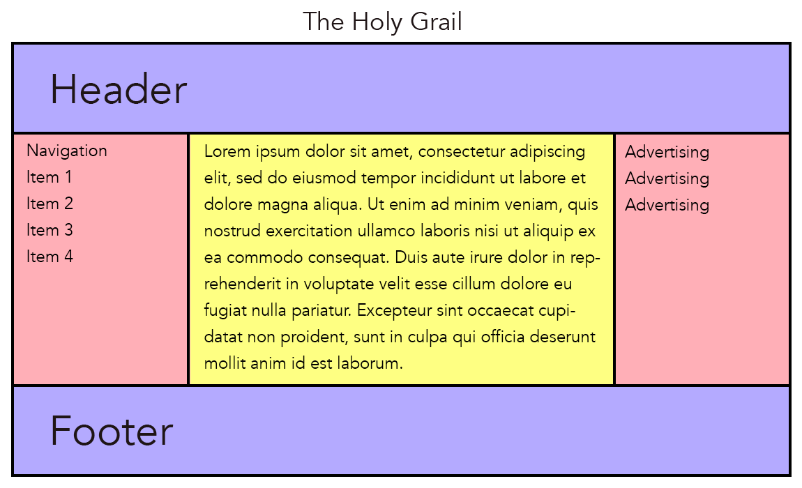 Flexbox was a major improvement in that it allowed easier alignment and centering of content and it allowed equal height columns, regardless of the amount of content.
Flexbox layout is made up of flex container that hold flex items. You can lay out a container either horizontally (rows) or vertically (columns). Whichever you pick is called the main axis (usually rows) and then the other is called the cross axis. The flex items are laid out along the main axis and they can grow to fill unused space. By nesting other flex containers inside the main container, you can achieve control over both horizontal and vertical alignment, though Flexbox is by nature one-dimensional.
Flexbox provided us with powerful and useful tools for creating web layouts.
CSS Grid
The idea of using some sort of CSS-based grid system for layout had been kicked around for many years. Bert Bos and Håkon Wium Lie, the inventors of CSS, had worked on several ideas (source).
The idea that finally stuck was a proposal from some people at Microsoft who had been looking for a better layout tool for their browser. Microsoft actually shipped a grid layout implementation using the -ms- vendor prefix in Internet Explorer 10 in 2011. They followed that up with a draft Grid Layout spec, which they presented to the W3C in 2012 (source). Microsoft applied for and received a patent for their early work on CSS Grid back in 2012. It was referred to in the document as Rule-based grid independent of content.
Once the Microsoft implementation was released, a few web designers began to experiment. One in particular, Rachel Andrew, saw great promise in the approach and she developed a number of demos and examples to show how grid could be used to solve longstanding layout problems. Later, a designer with Mozilla, Jen Simmons, created a site called Labs that also helped illustrate the power of CSS Grid. Such efforts encouraged the W3C to work on it and release it as a spec. The first specification can be seen at https://www.w3.org/TR/css-grid-1.
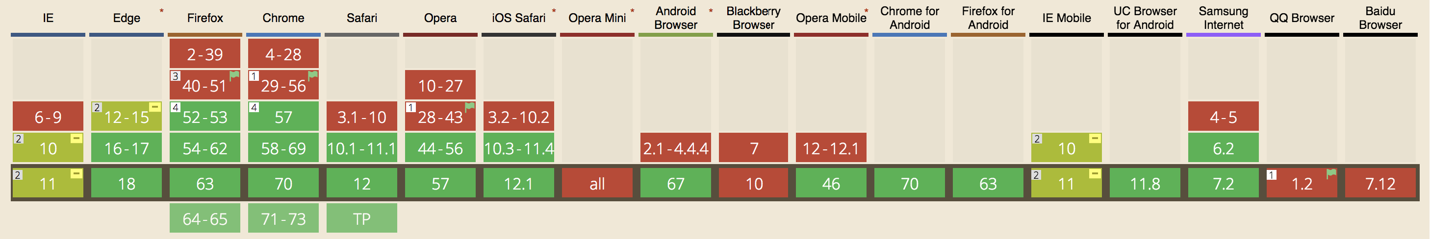
Browser support for CSS Grid made a huge step forward in 2017. Chrome, Firefox, Safari, and Opera all released versions with support in March, and Microsoft followed through with Edge in October. All major browsers now support it, as can be seen below and at caniuse.com.
CSS Grid is the first two-dimensional grid-based layout system, meaning it can handle columns and rows. It solves the layout challenges of the past and provides the tools needed to make a design vision a reality. No more floats or hacks or even frameworks. It is simply the most powerful tool made for web page layout and it's available now.