C
S
S
G
R
I
D

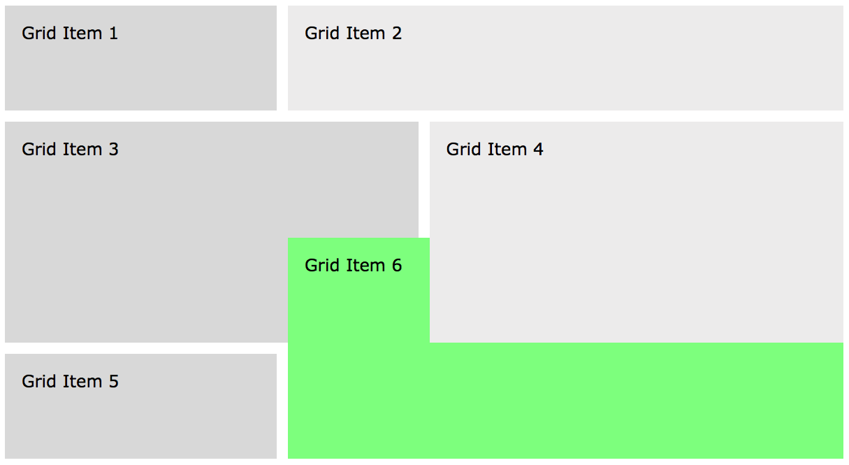
Layout with Grid Lines

CSS Grid has powerful new layout tools to create precise two-dimensional (both columns and rows) layouts. Once a grid container has been defined, grid items can be placed onto the grid using either grid lines or grid areas. We'll look at grid areas in our next lesson. Here, we will focus on using grid line designations to sort of "hang" grid items onto a grid.

Column Lines & Row Lines

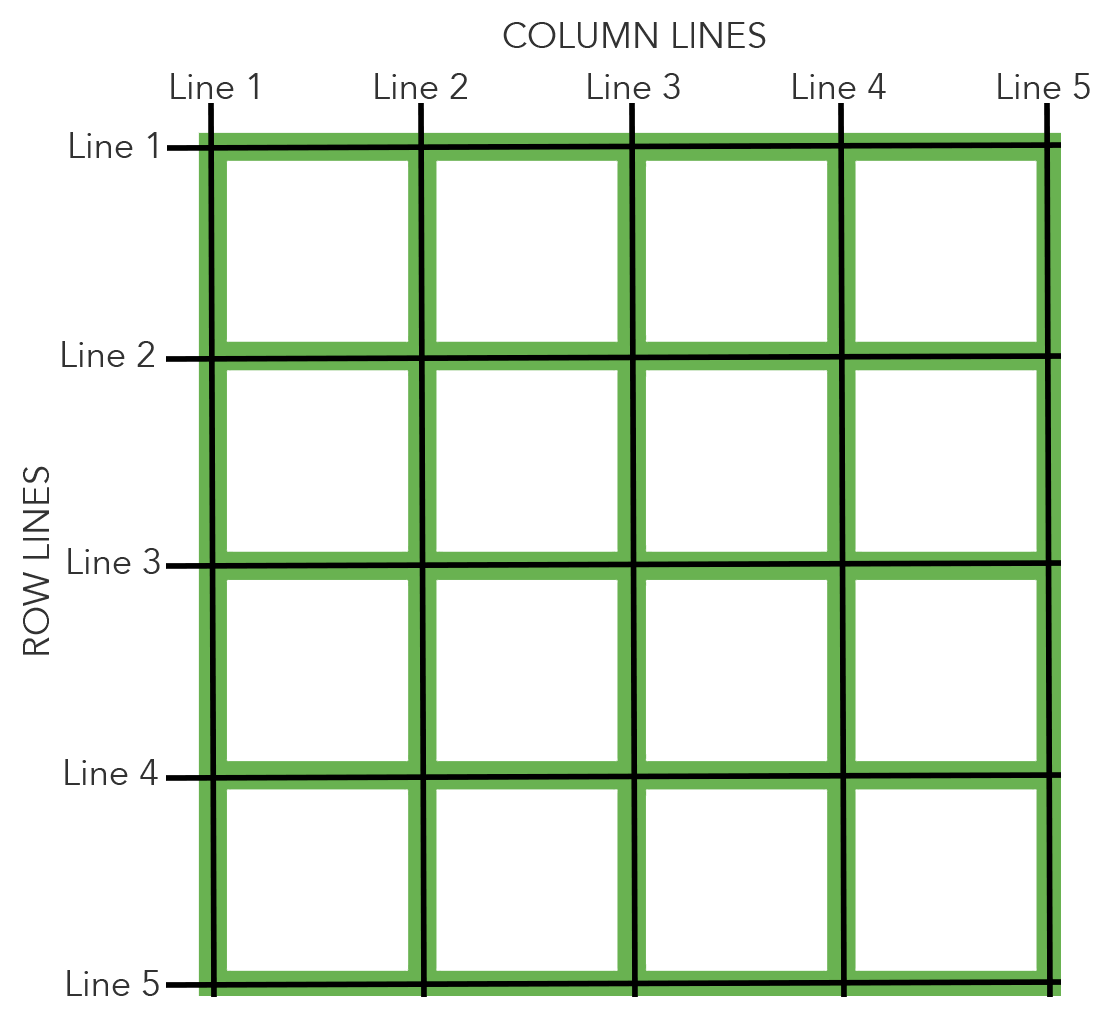
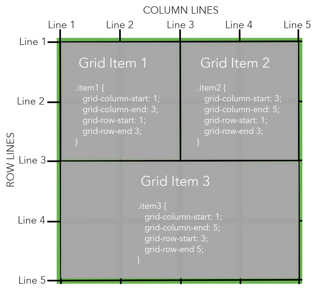
This grid container contains four columns and four rows. Column lines and row lines are numbered.

There is always one more column line than columns and there is always one more row line than rows. We use these lines to determine where to place grid items onto the grid.


In this example, we have decided to place three grid items onto the grid. Each item must have either a square or rectangular shape. There can be no "L" shaped grid items.

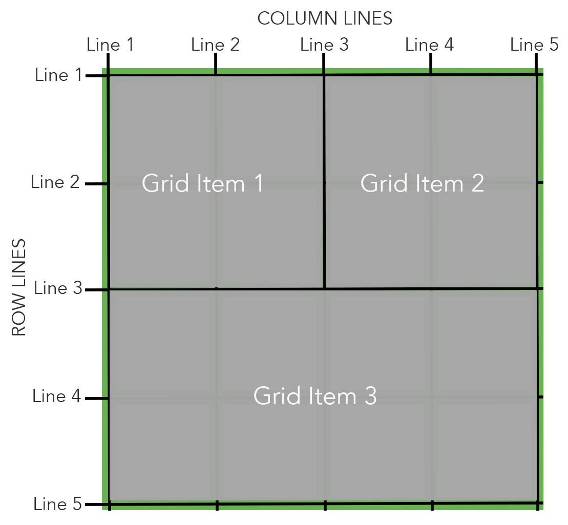
Grid item one starts on column line 1 and ends on column line 3. It starts on row line 1 and ends on row line 3.

Grid item two starts on column line 3 and ends on column line 5. It also starts on row line 1 and ends on row line 3.

Grid item three starts on column line 1 and ends on column line 5. It starts on row line 3 and ends on row line 5.

<style>
.container {
display: grid;
grid-template-columns: repeat(4, 1fr);
grid-auto-rows: minmax(150px, auto);
grid-gap: 1em;
}
.item1 {
grid-column-start: 1;
grid-column-end: 3;
grid-row-start: 1;
grid-row-end: 3;
}
.item2 {
grid-column-start: 3;
grid-column-end: 5;
grid-row-start: 1;
grid-row-end: 3;
}
.item3 {
grid-column-start: 1;
grid-column-end: 5;
grid-row-start: 3;
grid-row-end: 5;
}
</style>
<body>
<div class="container">
<div class="item1">Grid Item 1</div>
<div class="item2">Grid Item 2</div>
<div class="item3">Grid Item 3</div>
</div>
</body>

Grid Line Coding

The layout above is created with this CSS and HTML. Notice that we set up a grid container with four columns using grid-template-columns: repeat(4, 1fr). That means we have 5 column lines.

Grid item one uses grid-column-start: 1 and grid-column-end: 3 to indicate it should span column lines 1 through 3. We are also using grid-row-start: 1 and grid-row-end: 3 to indicate it should span row lines 1 through 3.

Grid item two uses grid-column-start: 3 and grid-column-end: 5 to indicate it should span column lines 3 through 5. We are also using grid-row-start: 1 and grid-row-end: 3 to indicate it should span row lines 1 through 3.

Grid item three uses grid-column-start: 1 and grid-column-end: 5 to indicate it should span column lines 1 through 5. We are also using grid-row-start: 3 and grid-row-end: 5 to indicate it should span row lines 3 through 5.

Below is how the page renders in a browser.

The "Explicit" Grid

Using grid lines to exactly state where grid items should be placed on a grid is an example of what is called the explicit grid. (Earlier, we learned that grid items can be placed implicitly via CSS Grid's auto-placement algorithm). Using grid lines allows us to explicitly state an item's location on two dimensions - both for columns and for rows. This is why CSS Grid is known as a two-dimensional layout system. This is one of the primary distinctions between CSS Grid and Flexbox. Flexbox is a one-dimensional system in that it allows layout for either a column or row, but not both at the same time.
<style>
.container {
display: grid;
grid-template-columns: repeat(6, 1fr);
grid-auto-rows: minmax(150px, auto);
grid-gap: 1em;
}
.item1 {
grid-column: 1/3;
}
.item2 {
grid-column: 3/7;
}
.item3 {
grid-column: 1/4;
grid-row: 2/4;
}
.item4 {
grid-column: 4/7;
grid-row: 2/4;
}
.item5 {
grid-column: 1/3;
}
.item6 {
grid-column: 3/7;
}
</style>
<body>
<div class="container">
<div class="item1">Grid Item 1</div>
<div class="item2">Grid Item 2</div>
<div class="item3">Grid Item 3</div>
<div class="item4">Grid Item 4</div>
<div class="item5">Grid Item 5</div>
<div class="item6">Grid Item 6</div>
</div>
</body>

Using both Implicit and Explicit Grid

Most often, we build a grid by using a combination of an implicit grid and an explicit grid. We'll create a simple layout, as shown below. We have taken the liberty of drawing gray lines on the image to show that it's a six column grid and to show the locations of the column lines and row lines.

Starting CSS

This is a six column grid container using grid-template-columns: repeat(6, 1fr).

Starting HTML

There are six grid items.

We'll explicitly state all of the grid columns, but we'll only explicitly create rows when needed (such as for grid items 3 and 4). Otherwise, we'll let the auto-placement algorithm place the grid items on rows implicitly.

We will also use shorthand for the column and row designations. For example, instead of typing out both grid-column-start: 1 and grid-column-end: 3, we'll do that all with one declaration such as grid-column: 1/3.

Notice that we did not state the grid rows for most of the elements. Grid items 3 and 4 were designated to take up both rows two and three, so the next grid items (items 5 and 6) were automatically placed onto row four. Here, we have used both the explicit and the implicit grid.

<style>
.container {
display: grid;
grid-template-columns: repeat(6, 1fr);
grid-auto-rows: minmax(150px, auto);
grid-gap: 1em;
}
.item1 {
grid-column: 1/3;
}
.item2 {
grid-column: 3/7;
}
.item3 {
grid-column: 1/4;
grid-row: 2/4;
}
.item4 {
grid-column: 4/7;
grid-row: 2/4;
}
.item5 {
grid-column: 1/3;
}
.item6 {
grid-column: 3/7;
grid-row: 3/5;
background-color: #8f8 !important;
}
</style>
<body>
<div class="container">
<div class="item1">Grid Item 1</div>
<div class="item2">Grid Item 2</div>
<div class="item3">Grid Item 3</div>
<div class="item4">Grid Item 4</div>
<div class="item5">Grid Item 5</div>
<div class="item6">Grid Item 6</div>
</div>
</body>

Overlapping Elements

With CSS Grid, it's easy to overlap elements partially or completely. In the example below, grid item six (shown in green) overlaps parts of both grid item three and four. By default, elements stack in their HTML source order. This means that grid item six is stacking on top of grid items three and four because grid item six comes later in HTML source order.

One can change the default stacking order by using the z-index property. Elements with a higher z-index stack on top of items with a lower z-index.

Use the same code as in the previous example, but change the row line numbers for grid item six so that it overlaps grid items three and four. You can do this by adding grid-row: 3/5 to grid item six. (We are also using some CSS to give the grid item a green background for it to stand out).

Stacking with Z-Index

You'll next want to experiment with the stacking order. Put the following declaration into the CSS for grid item four: z-index: 2. Notice that grid item four now stacks on top of grid item six because it has a higher z-index, as shown below.

Note: Actually, grid item six has no z-index listed. When no z-index is listed, it has a z-index value of zero.