<style>
.container > div {
<body>
<div class="container">
</body>
.container > div {
background: #eee;
padding: 1em;
}
.container > div:nth-child(odd) {padding: 1em;
}
background: #ddd;
}
</style>}
<body>
<div class="container">
<div>Grid item one.</div>
<div>Grid item two.</div>
<div>Grid item three.</div>
<div>Grid item four.</div>
</div><div>Grid item two.</div>
<div>Grid item three.</div>
<div>Grid item four.</div>
</body>
Grid Basics
Getting Started
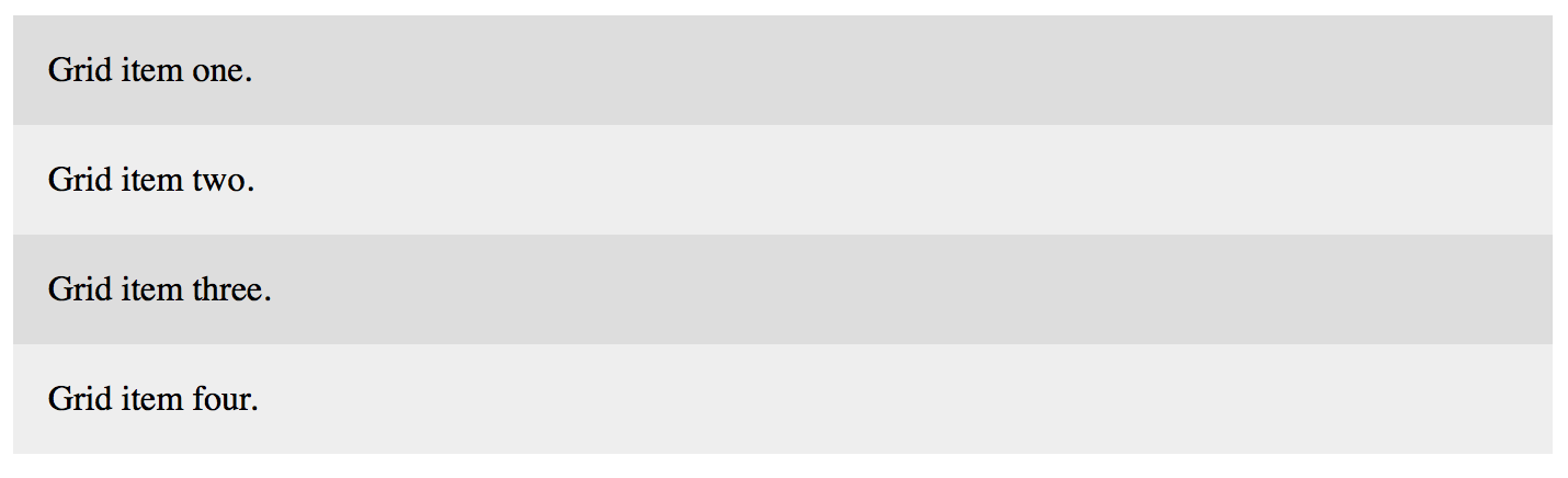
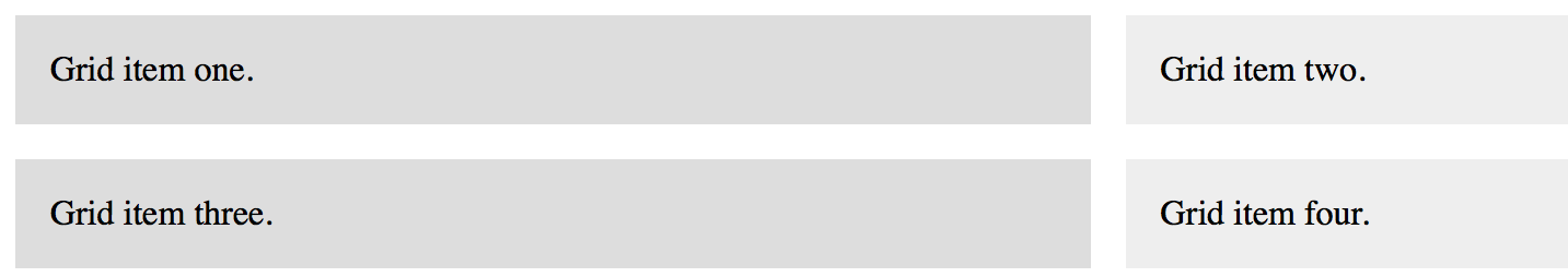
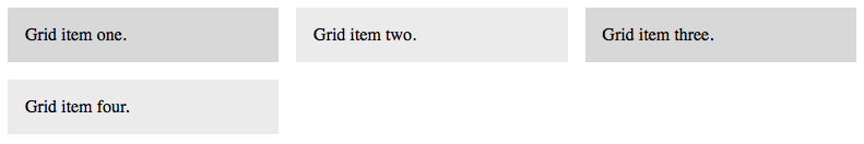
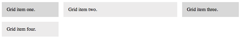
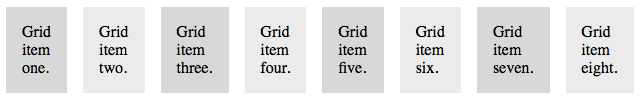
We'll begin by adding a little CSS to automatically shade the grid items in alternating shades of gray. Use the CSS code to the left to take care of that.
Building a Grid Container and Grid Items
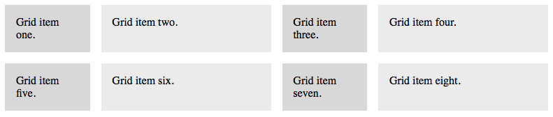
Next, well use HTML to create a generic element (a div with a class of .container) to serve as our grid container. All CSS Grid layouts start with a grid container. Inside the grid container will be a series of grid items ("elements" or "boxes") that will contain the content of this page. Use the HTML code to the left.
Below is what you get in a browser.