Responsive Layout without Media Queries
One of the most powerful features in the CSS Grid specification is the ability to create responsive layouts without using media queries. This is done by using the repeat function (covered earlier) along with auto-placement keywords auto-fit or auto-fill. These keywords allow you to place as many grid items of a particular size on a row that will fit within the width of the viewport.
Using the example below, make your web browser narrower and wider to see how using both auto-fit and auto-fill make the page behave.

NOTE: Up to a certain width, both auto-fit and auto-fill will have the same result. The difference between auto-fit and auto-fill can only be seen when there are fewer grid items than could fit on a row. In this example, each grid item is a minimum of 200 pixels and a maximum of 1fr.
You'll notice several things.
- When making the viewport narrower, both auto-fit and auto-fill automatically push grid items down to another row once each of the grid items would become narrower than 200 pixels wide.
- When making the viewport wider, auto-fit makes the grid-items stretch to fill out the row.
- When making the viewport wider, auto-fill puts in empty columns on the row.
Notice the column line numbers in the illustration below. At this particular viewport width (1,215 pixels), a total of six 200 pixel wide grid items could fit on the row. Because there are only four 200 pixel wide grid items on the row, CSS Grid creates two more columns. However, the way auto-fit and auto-fill handle those extra columns differs.
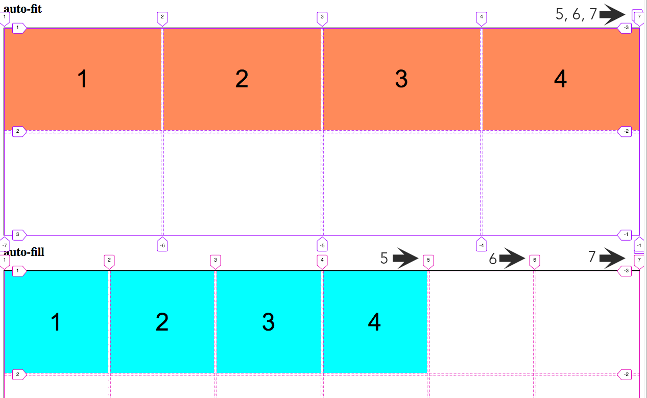
With auto-fit, columns 5 and 6 are actually created, but they are 0 pixels wide and are stacked one on top of the other. You can see this by noting the column line numbers 5, 6, and 7 at the top right. So, even though the cells are actually created, they don't show up.
With auto-fill, columns 5 and 6 are also created, but now they are are created with a 200 pixel minimum width and show up as blank cells at the end of the row.
There is actually very little code needed to make all this happen and it's all done with the grid-template-columns property in the grid container.
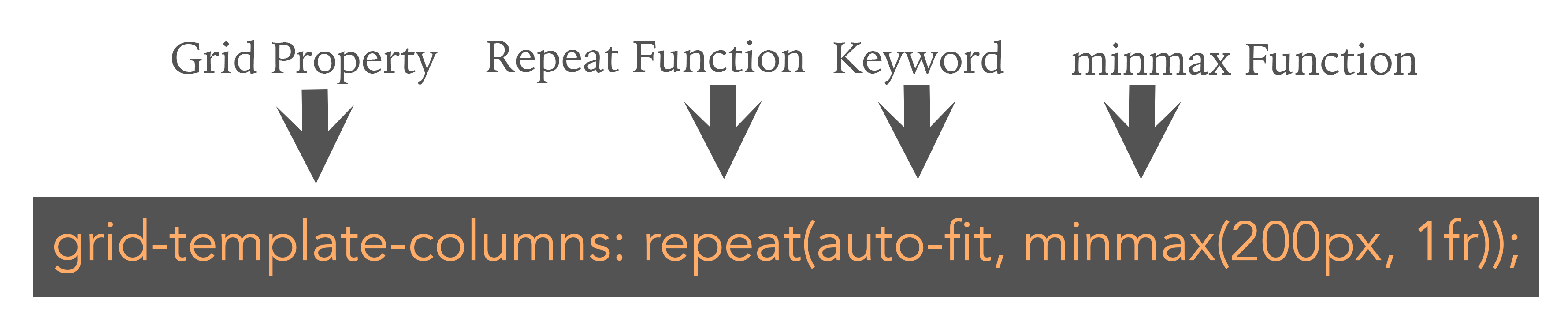
This grid-template-columns property uses the auto-fit keyword and sets the minimum width for each grid item to 200 pixels and a maximum width of 1fr (or, one fractional unit).